
The evolution of the all-important piece of paper
Trent University's degree - its history and replacability
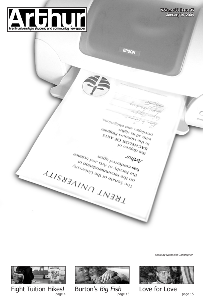
Most of us at Trent University are here to earn a degree. When it comes down to it, we invest thousands of dollars and three to four years of our lives in our post-secondary education to get a piece of paper.
Trent’s degree was designed around the same time that the university was built, by the late Alan Fleming, who was also the designer of the university’s logo. He felt that a new, decidedly modern university ought to have a modern degree style.
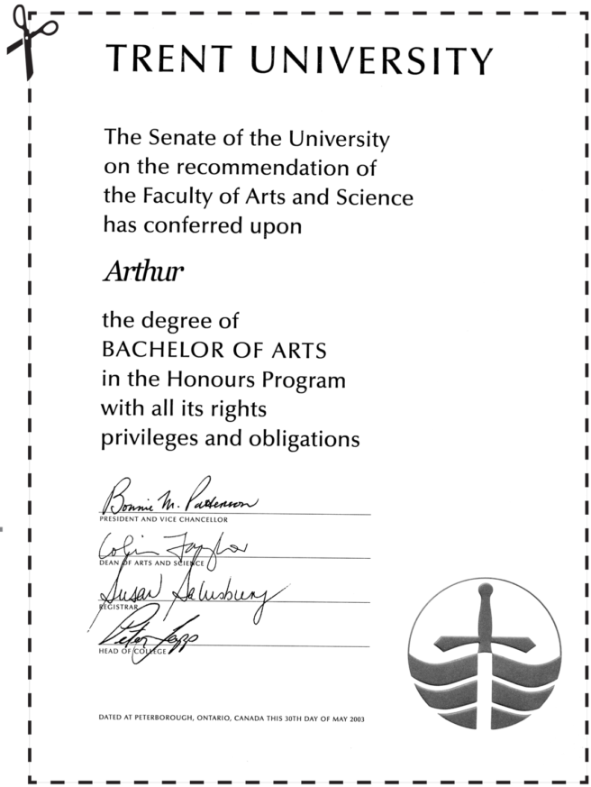
The university’s first degrees were printed in 1967. Since that time, the Trent degree has undergone significant transformations—most significantly at the time that the university switched to producing the degree with a laser printer in 1993. The degree had earlier featured calligraphy, and an embossed university logo, and had been all white.
Arthur spoke with four Trent graduates and one current student about their degrees. The people that graduated with the “old” Trent degree were pleased with it, and described it as simple yet elegant and dignified. Meanwhile, the post-1993 graduate that was interviewed expressed her displeasure with the current degrees.
Tui Menzies
Administrative Assistant, Julian Blackburn College
Graduated from Trent in 1976
I love the simplicity of my Trent degree–it makes us distinct. It has an understated elegance. My mother graduated from McMaster in the 1940s and her degree has a big gob of wax with ribbons all over the place–it looks like something she won at the Royal Winter Fair. A lot of thought and planning went into the original design of the Trent degree–a new degree would require just as much thought.
Manindra Shah
Bibliographic Searcher in Bata Library
Graduated from Trent in 1972
The degree itself has changed over time. When I got it, it was completely white wth an embossed logo. When my daughter graduated a couple of years ago I noticed that her degree had a bit of colour on it. When we went to get her degree framed the person who framed it said it was too bad that they kept changing the green. Apparently the Trent degree had different shades of green on the logo over the years. It looks nice as far as it’s in English where you can read it as opposed to Latin. I wish there was more colour to it–a consistent colour! I think that the embossed logo looked more dignified. My degree is individually singed by the heads of all the colleges and president Tom Symons.
Martin Boyne
Director of Academic skills
Graduated from Trent in 1989
I wasn’t all that unhappy with my degree when I got it.
Perhaps because it was the first one I ever received. It was dignified, it looked good and had no seal or fancy gold embossing. I wasn’t unhappy with the current degree but I am not opposed to any change as long as it stays with Trent’s tradition with being appropriate and not gaudy. The only thing I’ve complained about is that some of the ink from the signatures has faded.
Later on I received my MA in Education from the University of Toronto. The degree was slightly nicer because it was more colourful, but they are side by side and they complement each other.
Maureen Brand
Office Manager for the Leahys
Graduated from Trent in 1993
I was in the class that received the first year of colourised degree. I like my degree, also I am one of the last years that all the heads of the colleges and the president of the university signed in ink. Shortly after I graduated they got printed off the laser printer. One guy signed in blue ink one guy signed in black.
I love that it’s not in Latin. I look at other degrees and it’s literally foreign–nobody speaks Latin. It’s nice that other schools give their degrees in Latin. But you can’t share those degrees with other people and I think it creates a bit of snobbery. Latin comes from a very old history and not to be disrespectful of that history–it has it’s place–if you can’t speak Latin they say it doesn’t look prestigious.
Trent is not like any other school. I have friends who are international students and I’ve never heard them complain about the degree. It’s up to that person who’s getting a job to convince their employer that that is a real degree. In this day and age where you can get your degree on the internet I can see how someone might be skeptical. You see some 100-year-old degrees in a dentist shop that looks faded, worn and loved; maybe we need to see blue ink again on the degree. I love my degree, I love showing people my degree. If I had my own office I’d hang my degree. It should be a source of pride for people. My name is handwritten. I don’t know who used to do it. My name is in black ink by hand. It’s beautiful.
Very simple it goes along with the lovely elegant lines with the rest of the degree.
Katie Nice
Graduating from Trent in 2004
I went to my friend’s graduation last year and was shocked at how the degree looked. First of all it is lacking in information as there is no mention of a major.
Secondly, the degree looks like it was printed off a home computer. I am shocked that they would give us such shoddy, easily replicable degrees in this age of identity theft.
It’s ridiculous that we spend so much money at university and get such a crappy looking degree. I will be the first person in my family to graduate from university and I want a degree that I can be proud of.
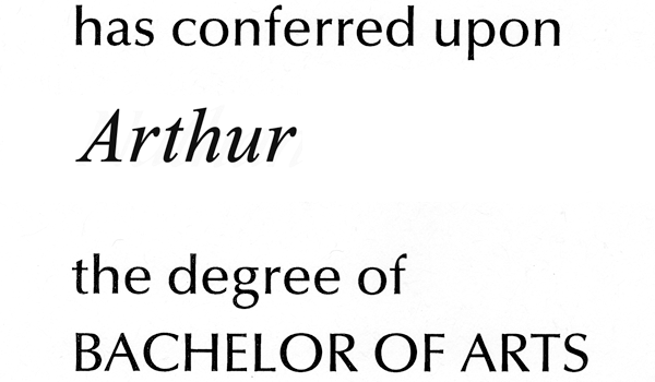
In the degree’s early days, the graduate’s name was written out by a calligrapher in a font that was similar with the that of the printer (Optima). The degrees are now spat out by an anonymous laser printer. Once
again, art succumbs to the relentless pursuit to do things faster and cheaper.
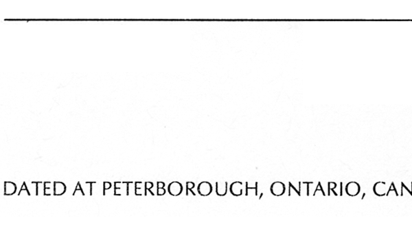
The university has oscillated on the question of where this date is to be placed on the degree. On the original Trent degrees of the late 1960s, the date appeared on the left; in
1975, it was transposed to the bottom of the degree, before being moved back to its original position in 1993. Once upon a time, this date was also hand-written by a calligrapher.
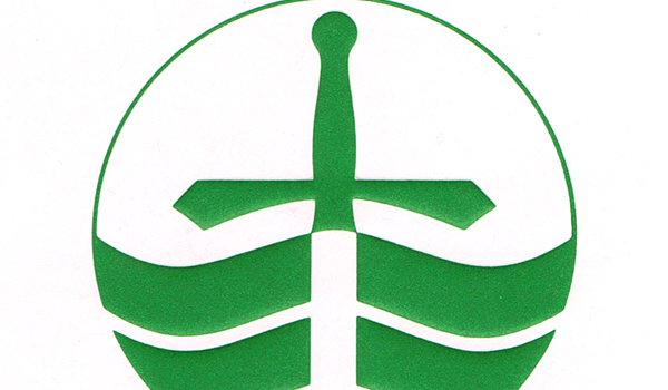
The shade of green of the logo has been reported to vary from year to year. Prior to the 1993, this logo was embossed, and appeared in relief on the white paper–very dignified.
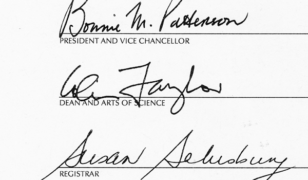
Think this was actually signed by the president? Outdated labour-intensive practices like signing papers with pens have become obsolete in the new world of Trent degree production a la laser printer.